Journal Entry: The evolution of The Copping Unknown Brand
Original bronze design on black background showing "Copping Design"
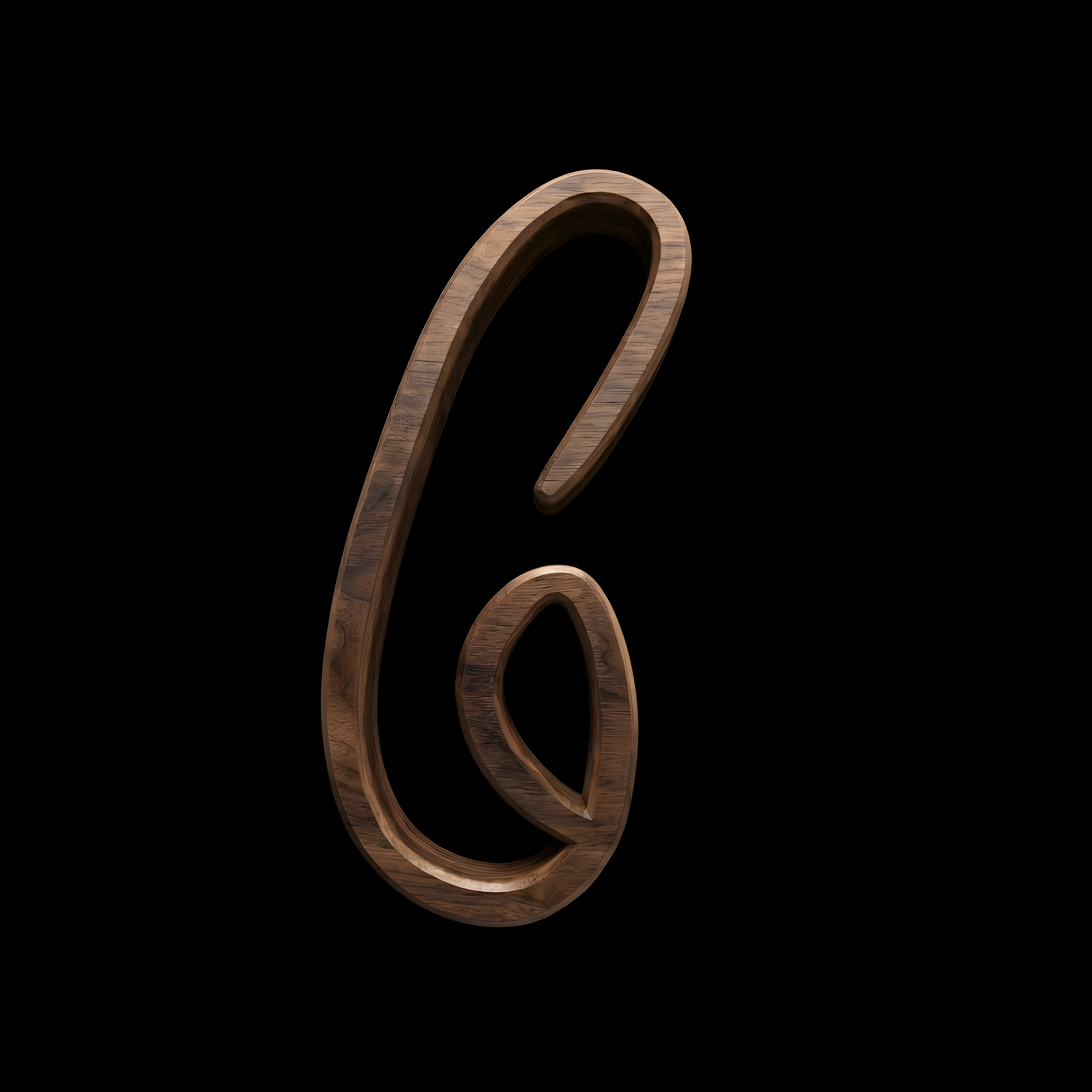
Original bronze design on black background showing the letter C
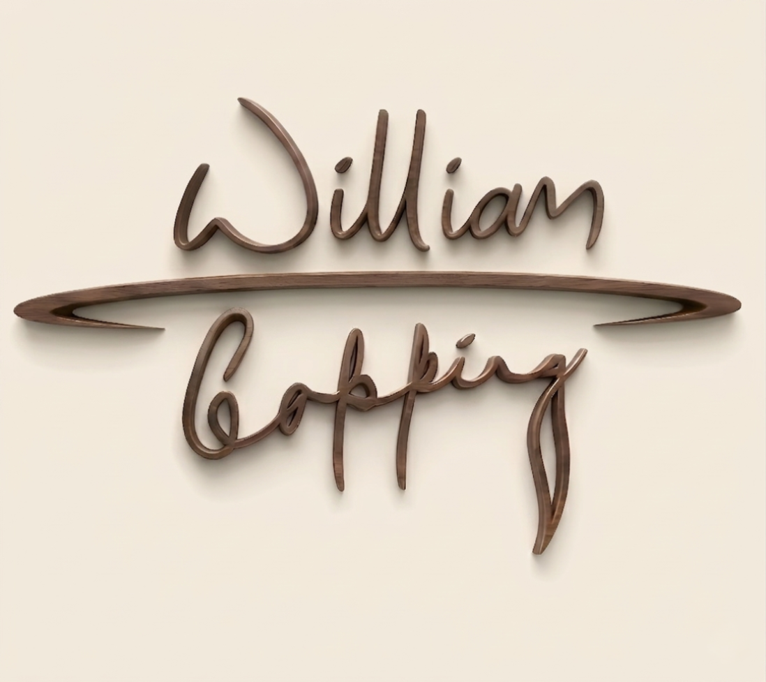
Early bronze design on off white background showing "William Copping" vertically separated by a bronze line.
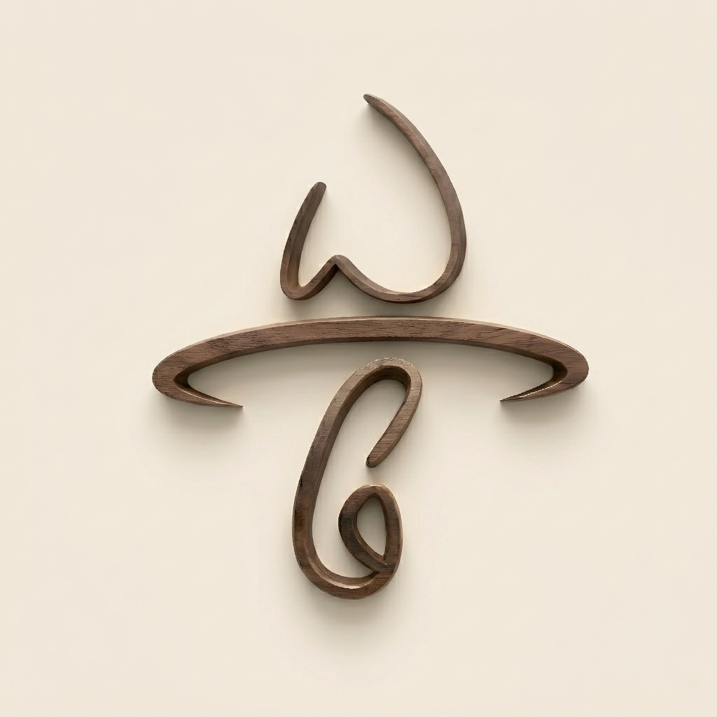
Early bronze design on off white background showing The letters W and C vertically separated by a bronze line.
Copping Unknown brand logo featuring an embossed bronze handwritten signature paired with crisp serif typography against a black background.
Copping Unknown monogram mark displaying a stylised bronze script letter C overlapping the word Unknown against a black background.
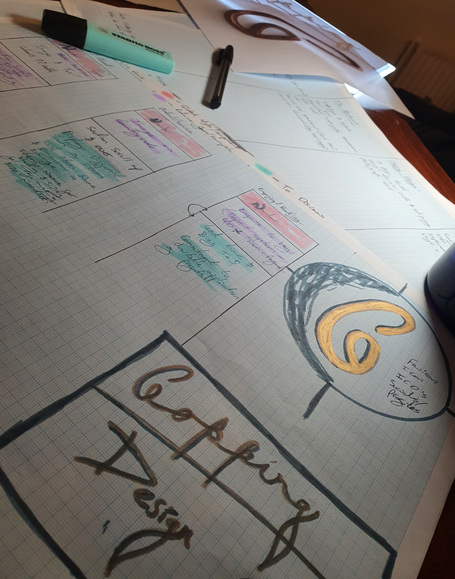
A pile of chart paper showing the first Bronze examples of the original logos before they were made digital. It also shows some wireframes for websites on the graph paper to the left of the logos.
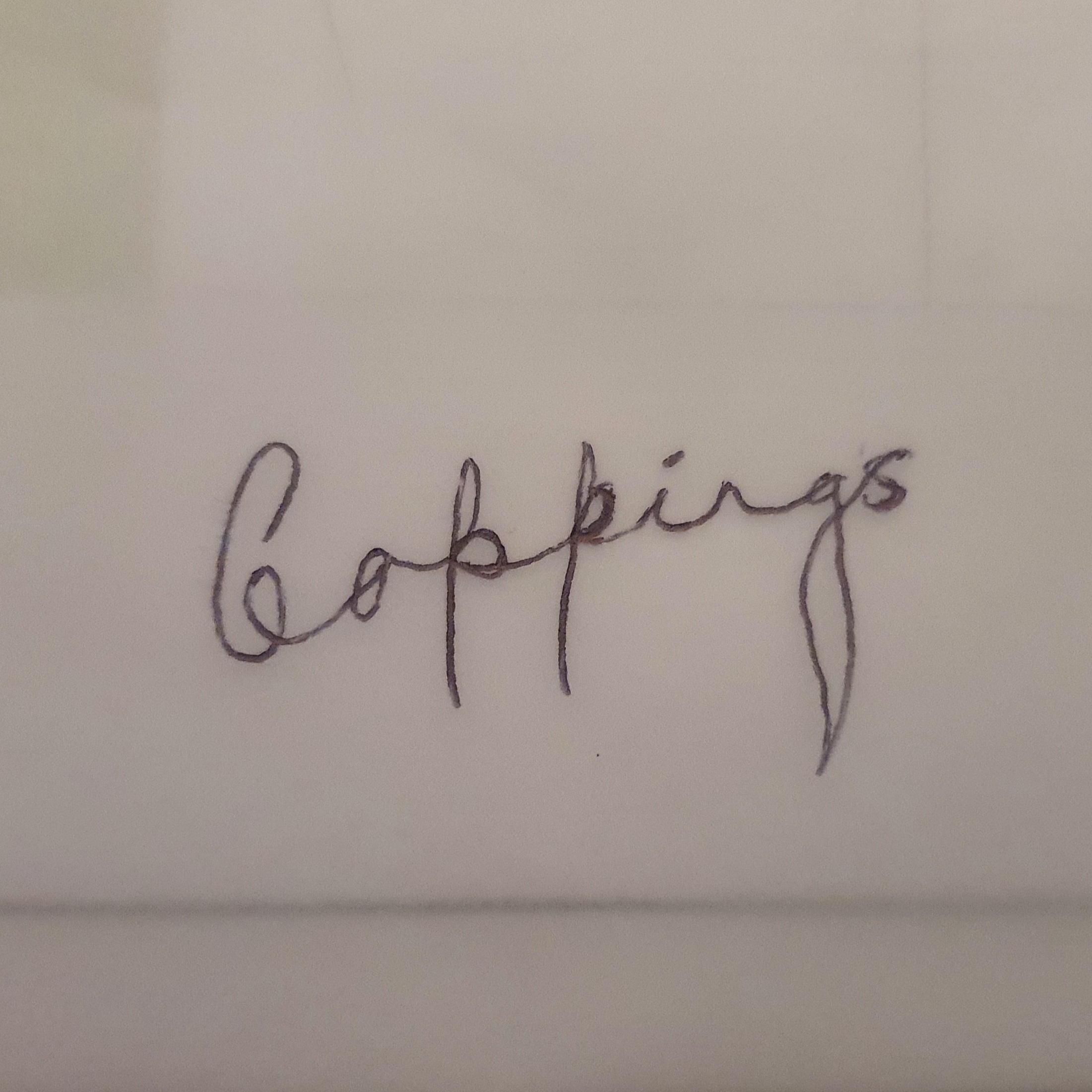
Original Copping Signature in ink on white paper.
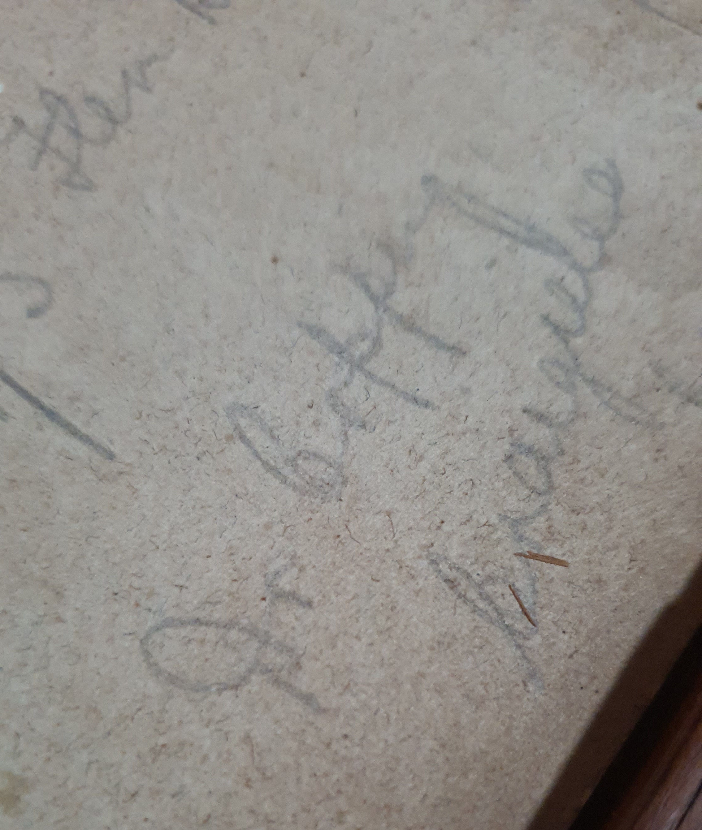
Dr Lancelot Coppings signature in pencil on the back of a watercolour painting
No items found.

When I decided to bring back to life the families lost name I was focused on the design and artistic aspect of the families history.

I then went on to appreciate the value in personal idendity and how that works on social media in the modern age.

‍

After some introspection I realised I wanted to build a brand that would be able to grow and serve others as partner, employer and organisation with a strong ethical aim to help narrow the socio economic gap.

With the ambitions we have it seemed prudent to develop a brand that will be able to serve future generations as the family name once did in rural lincolnshire and beyond.